

Design for the archaeological exhibition “ATRADUMI" ("Finds")
Visual identity and graphic design for the archaeological exhibition at the “Draugu nams” gallery in Cēsis.
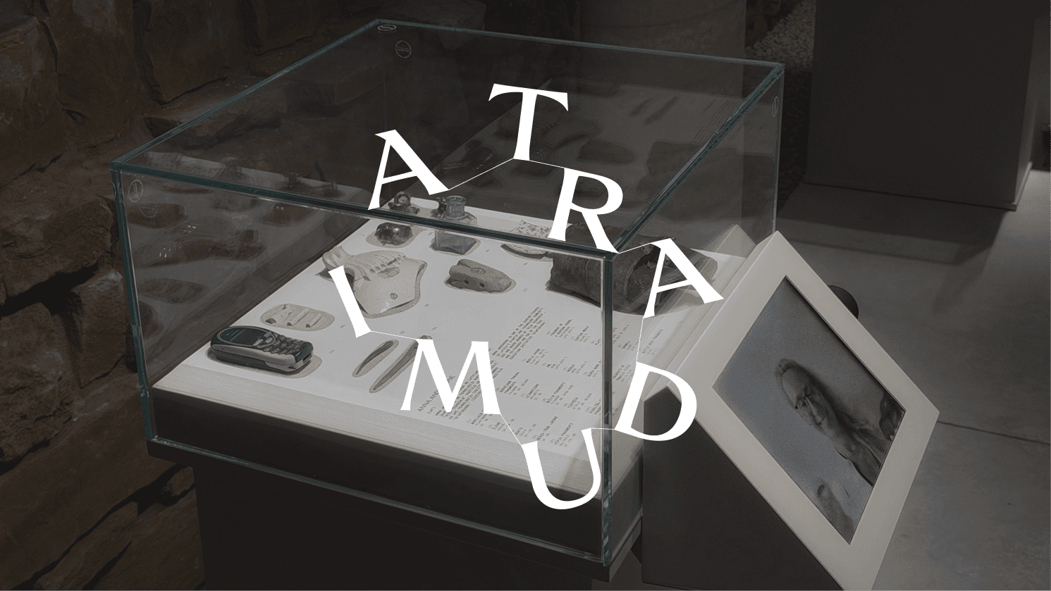
ATRADUMI introduces objects uncovered during the restoration of Konrāds Quarter, from centuries-old historical evidence to recently lost everyday items. As part of the project, we created the exhibition’s visual identity, graphic materials, and the design concept for the display case design. The task was to develop a cohesive visual language that aligns with Mājas Cēsīs’ contemporary approach, helps visitors navigate the layered content, and introduces the exhibition concept before they even begin viewing the objects.
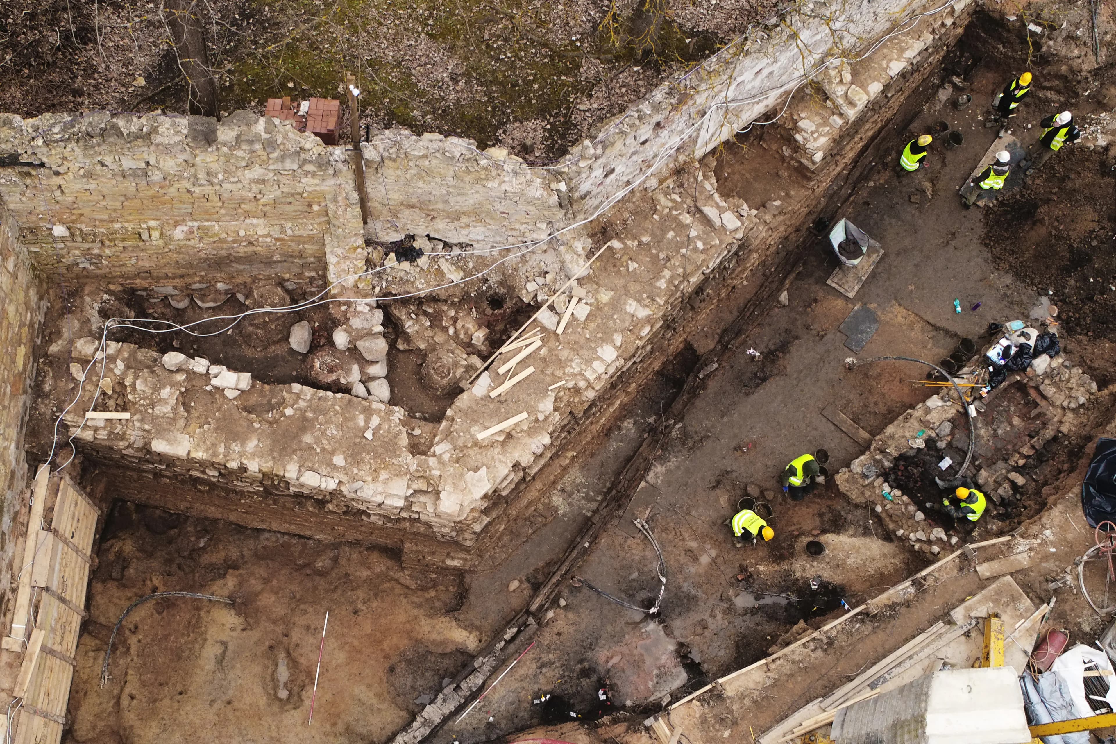
Archaeological excavations: photo by Mājas Cēsīs
Origins of the concept
At the heart of the exhibition is the question of what gives an object value. The selection of exhibits was made by 10 well-known figures in Latvia, each choosing finds that surprised them, sparked associations, or reminded them of something personal. As a result, the history of each object is enriched by human interpretation, while viewers can discover connections to their own experience. History is revealed through multiple perspectives rather than a single fixed judgment.
The starting point for the visual identity was the act of discovery itself. The letters of the word ATRADUMI were scattered across the composition, inviting the viewer to visually gather them and piece them together. The title becomes not just information, but also a small act of discovery, the first experience of the exhibition’s idea.


Design system
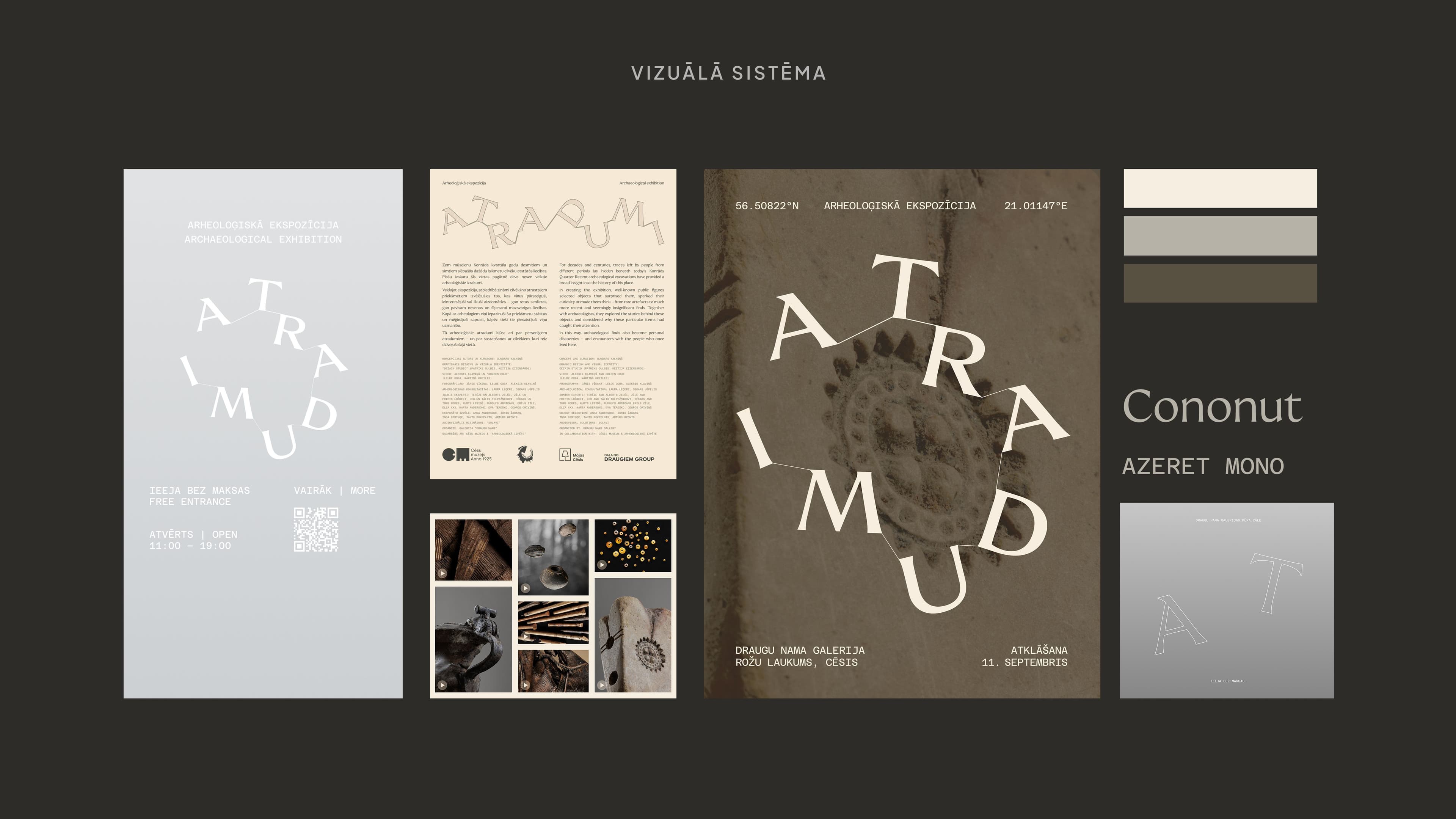
The identity is built on the contrast between freely arranged letters and precisely structured information. Fine lines connect the letters of the title, while different arrangements allow the composition to adapt to various formats. This principle was applied across the key visual, introductory panel, and window graphics, maintaining a consistent character at different scales.
The expressive title is balanced by calm, clear information design. The text hierarchy, the layout of Latvian and English, and the numbered object annotations organize the historical context and exhibit descriptions. The title encourages searching; the rest of the information helps explain what has been found.
The motif of discovery continues in the display base design. Flowing recesses were shaped to fit the contours of the objects and filled with quartz sand, while the annotations were printed directly onto the base. Rather than imitating an excavation site, the solution creates a restrained reference to earth and uncovering. The light surfaces keep the objects’ forms and textures at the center of attention.
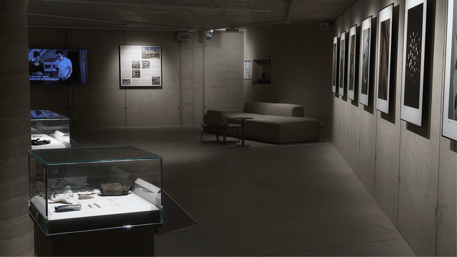
The permanent exhibition is designed to allow for periodic changes in both the selection and the participants. A unified graphic language gives these different stories a shared framework without imposing a single interpretation. The design gives the exhibition a recognizable character while keeping the finds and the people who selected them in the foreground.
Concept author and curator: Gundars Kalniņš
Graphic design and visual identity: Dezain Studio (Keitija Eizenbārde and Patriks Gulbis)
Exhibition video: Aleksis Kļaviņš and Golden Hour (Lelde Goba, Mārtiņš Kreilis)
Exhibition photography: Jānis Vīksna, Lelde Goba, Aleksis Kļaviņš
Archaeological consultation: Laura Lēģere, Oskars Ušpelis
Exhibit selection: Anna Andersone, Juris Žagars, Inga Sprinģe, Jānis Rokpelnis, Artūrs Mednis
In collaboration with: Cēsis Museum and Arheoloģiskā izpēte
Team

Keitija Eizenbārde

Patriks Gulbis

Sharpen your clarity thinking with
real examplesSharpen your clarity thinking with
real examples
3 industry examples from design, UX, and psychology twice a month – see it, experience it, understand it.