

Exhibition design for "Screen" by Ritums Ivanovs
Visual identity and exhibition graphics for Ritums Ivanovs’ solo exhibition at "Draugu nams" gallery in Cēsis.
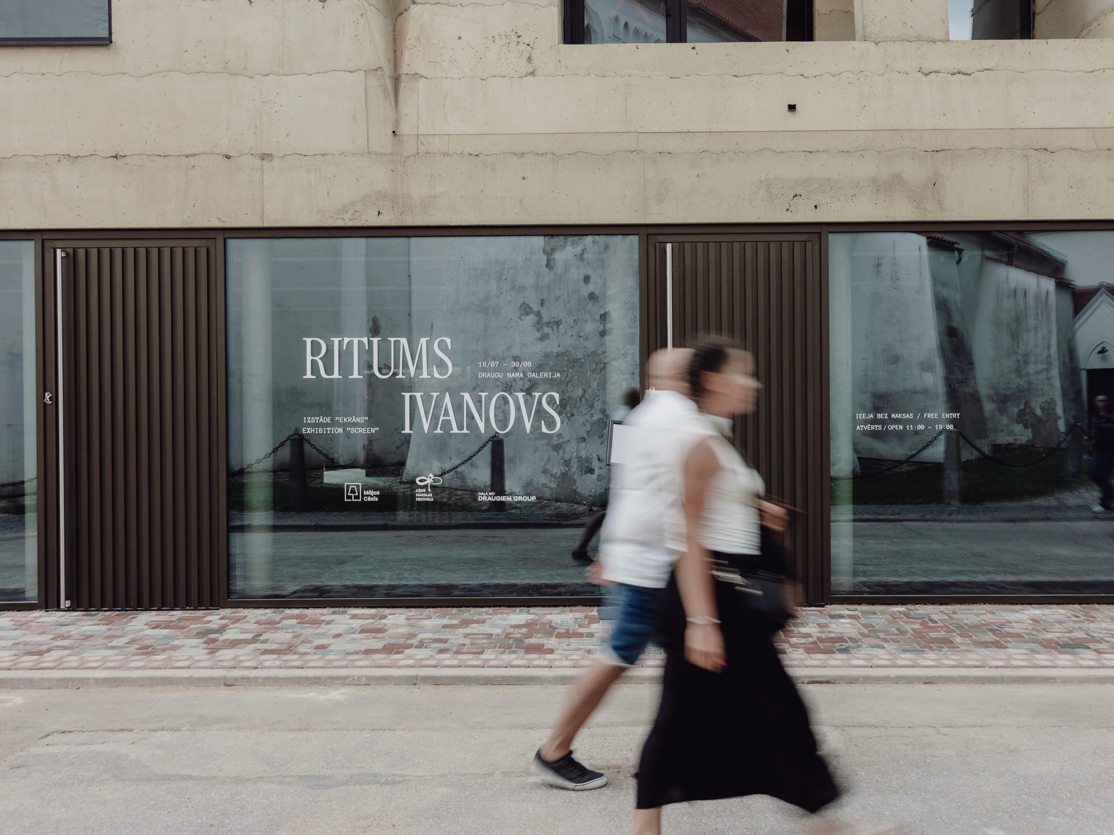
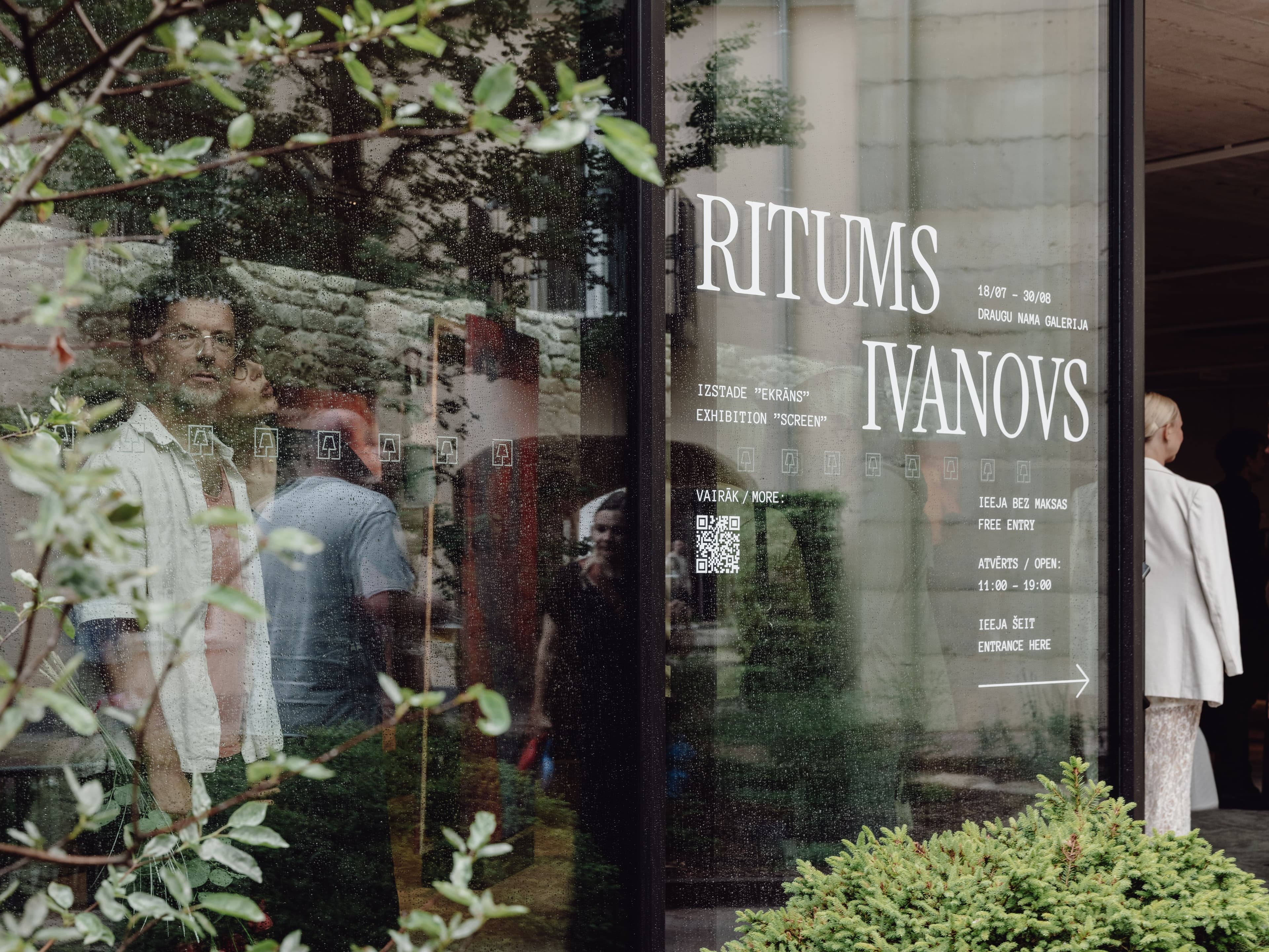
Screen was the inaugural exhibition of Draugu nams gallery in Cēsis, presenting work by Latvian painter Ritums Ivanovs. The commission included the development of the exhibition’s visual identity and communication system across physical and digital touchpoints. Beyond providing practical visitor information, the identity established a coherent visual framework that introduced the exhibition concept before visitors entered the gallery.
Concept origin
The exhibition explores how portraiture is experienced in an age dominated by screens. Rather than treating the screen as a neutral medium, Ivanovs uses painting to slow down the viewing process, transforming fleeting digital images into physical objects that require sustained attention. The visual identity was developed from this tension between digital and material perception. Its colour palette references the blue light emitted by screens in dark environments, while vertical graphic elements echo both the pixel structure of digital displays and the subtle visual distortions associated with electronic images.
Design system
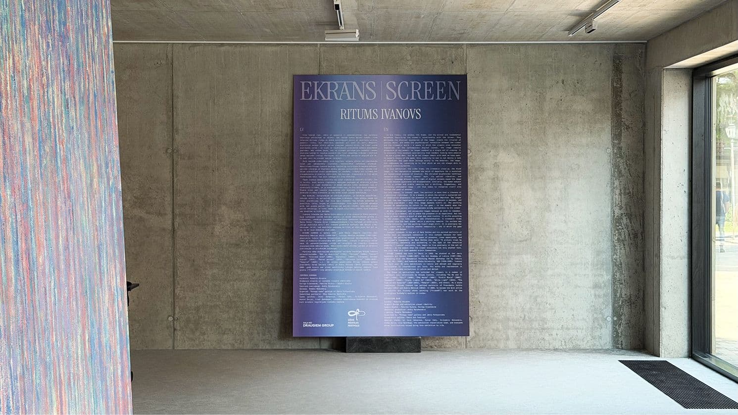
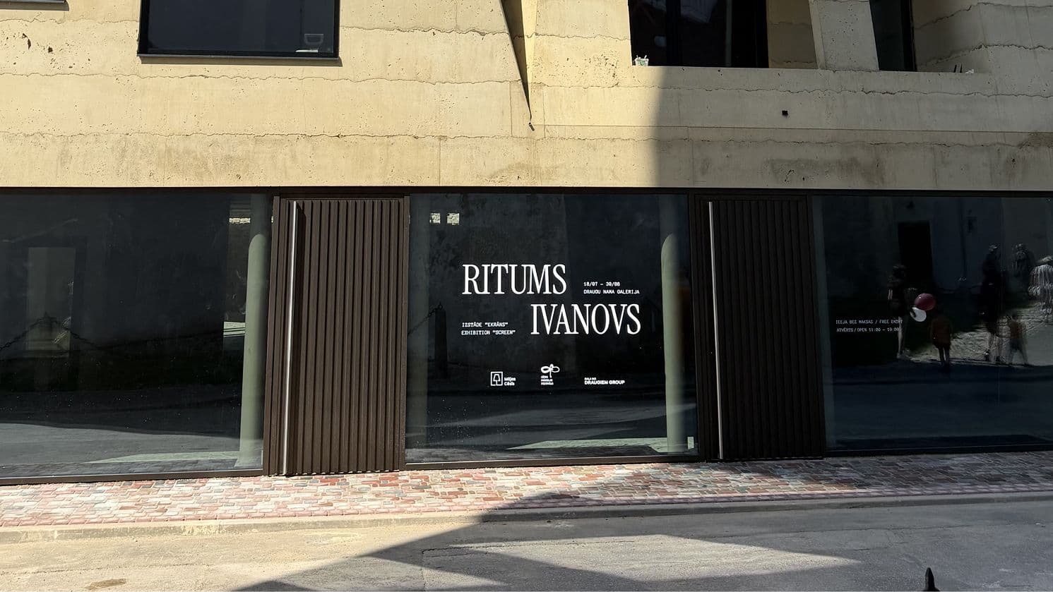
The identity combines two contrasting typographic voices. Selected letterforms in the exhibition title were merged and subtly distorted, suggesting the fluid and unstable nature of screen-based imagery without compromising legibility. A system of vertical lines was used consistently throughout the exhibition graphics, functioning as a unifying visual device across exhibition signage, introductory panels, window graphics, printed materials, and digital communication. The restrained palette and minimal compositions were intentionally designed to support the paintings rather than compete with them, allowing the exhibition narrative to remain the primary focus.
Outcome / role of the work
The graphic identity provided a consistent communication system for the first exhibition at Draugu nams gallery, guiding visitors through the space while extending the exhibition’s central idea across every touchpoint. From the gallery façade to the introductory wall text and supporting materials, the system connected practical wayfinding with conceptual interpretation, creating a recognisable visual language that established the gallery’s first public programme.
Team

Keitija Eizenbārde

Patriks Gulbis

Sharpen your clarity thinking with
real examplesSharpen your clarity thinking with
real examples
3 industry examples from design, UX, and psychology twice a month – see it, experience it, understand it.