
Design System to Code: How Growing Teams Stop Rebuilding the Same Interface
How design systems turn repeated interface decisions into reusable product infrastructure.
A digital product rarely loses consistency in one dramatic moment.
It happens quietly.
A new landing page is shipped quickly. A product feature needs a slightly different layout. A campaign gets its own button style because the old one does not quite work. A form is rebuilt by a different developer. A heading size is adjusted for one screen and never brought back into the system.
None of these decisions feel dangerous in isolation. Most of them are made for good reasons: speed, deadlines, flexibility, a specific business need. But over time, the product starts to carry the history of every urgent decision.
The interface still functions, but it no longer feels fully managed.
Buttons vary by a few pixels. Cards use different spacing. Forms ask for information in different ways. Empty states sound like they were written by different teams. The marketing site feels more polished than the product, or the product feels clearer than the sales pages. Every new feature takes longer to review because the team is not only discussing what should be built, but also how it should look, behave, and fit into everything else.
This is usually the point where a design system stops being a nice internal asset and becomes operational infrastructure.
Not a trend. Not a Figma-cleanup project. A way to stop paying for the same decisions again and again.
A design system is not a component library
A component library is useful, but it is only one part of the system.
A real design system defines the shared logic between design, development, content, and product decisions. It gives the team a common language for how the interface should work, not only how it should look.
That includes design tokens, reusable components, layout patterns, accessibility standards, naming logic, content behaviour, developer documentation, and review routines. It also includes the less glamorous details that make a system usable in real work: when to use a component, when not to use it, how dense a layout can become, how errors should be written, and how marketing pages can feel expressive without breaking the product’s core identity.
The goal is not to make every screen identical. That is a common misunderstanding.
The goal is to make every new screen feel intentional.
A strong system gives teams room to build, but within a structure that protects quality. It helps designers move faster because the foundations are already decided. It helps developers build with fewer one-off solutions. It helps product managers review work against shared rules instead of personal taste. And it helps users feel that the product is stable, coherent, and trustworthy.
Drift is not a visual problem. It is a cost problem.
Interface drift often looks small from the outside.
A button has different padding. A card has a different radius. A table uses another spacing rhythm. A mobile view breaks hierarchy. One input field has helper text, another does not. One error message explains what happened, another simply says “Invalid.”
Individually, these are not major failures. Together, they create friction across the entire team.
Designers spend more time making decisions that should already be settled. Developers rebuild familiar patterns instead of improving the product. Product managers leave the same review comments across different features. QA has more edge cases to catch. Users have to relearn small behaviours from one flow to another.
The brand also starts to weaken. Not because the logo changed, but because the experience no longer behaves like one company.
This is where design systems create business value. They reduce repeated decisions. They make quality easier to maintain. They turn consistency from something people have to remember into something the system makes easier to execute.
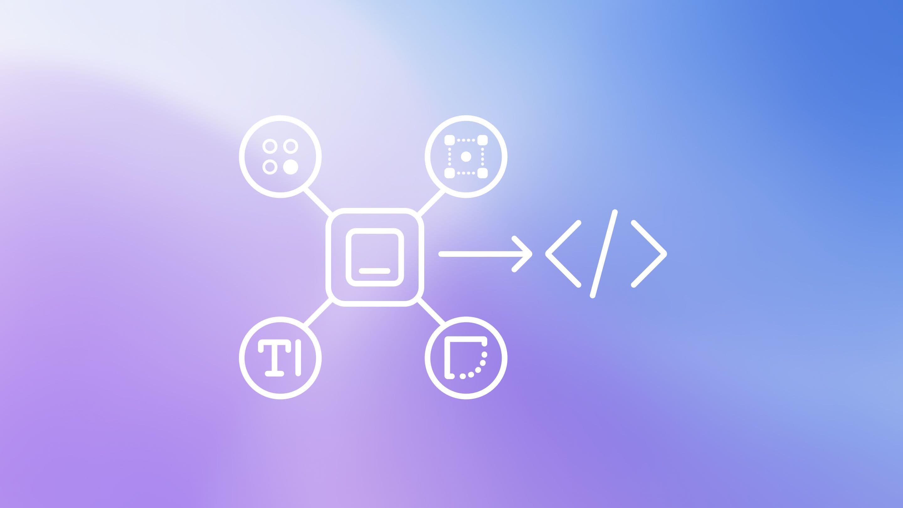
Design to code is where the system becomes real
Many design systems look convincing in presentations. Fewer survive production.
The difference is the code layer.
If the system only exists in Figma, it is vulnerable. Designers may use the latest component, while developers maintain an older version in the product. Marketing may build campaign pages with a separate logic. Product teams may adjust patterns to solve local problems. Over time, the company ends up with multiple versions of the same interface: the design version, the production version, the marketing version, and the “we had to ship it quickly” version.
Design to code closes that gap.
It translates visual decisions into reusable components, tokens, documentation, and implementation rules that developers can actually work with. It connects the design language to the production environment, so the system can survive deadlines, new features, new team members, and changing business priorities.
This is the difference between having a design system and operating with one.
Tokens turn taste into infrastructure
Design tokens are small, but they carry a lot of power.
They are named decisions for colour, typography, spacing, radius, shadows, motion, and breakpoints. Instead of choosing values manually every time, the team works from shared rules.
That may sound technical, but the business value is simple: the interface becomes easier to control.
If the primary colour needs to change, the team should not have to search through hundreds of screens. If spacing rules need to improve, the update should not require redesigning every layout from zero. If accessibility standards change, the system should be able to respond without turning every product update into a manual repair job.
Tokens make the brand and interface more adaptable. They give the team a way to evolve the product without rebuilding its foundations every time something changes.
Taste still matters. Craft still matters. But taste should not live only in individual decisions. At scale, it needs structure.
Components without rules still create confusion
A common mistake is to build components and assume the system is finished.
It is not.
A button component does not explain button hierarchy. A card component does not explain when a card should be used. A modal component does not explain whether the interaction should be a modal, drawer, page, or inline state. A form component does not define how validation works, how helper text should be written, or how errors should behave.
Without rules, people still guess. And guessing is exactly what the system was supposed to reduce.
A useful design system needs usage logic. It should answer practical questions: Which component should be used here? What problem is it solving? What are the limits? How should this pattern behave on mobile? What should happen when content is missing? How do we handle accessibility? Where can marketing be more expressive, and where does the product need stricter consistency?
This is the work that makes the system useful outside the design team.
Start with the decision you repeat most often
The best way to begin is not to design the whole system.
That usually becomes too large, too abstract, and too slow.
Start with the area where inconsistency is already costing the team time. It might be buttons, cards, forms, pricing sections, navigation, modals, dashboards, tables, badges, or page headers. The right starting point is usually the element that appears everywhere and creates the most review comments.
Choose one product or website area and list the repeated interface patterns. Then ask where the team is making the same decision again and again.
Which elements are redesigned too often?
Which ones are rebuilt too often?
Which ones create the most confusion in handoff?
Which ones slow down reviews?
Which ones would save the most time if they became reusable?
A design system does not need to start as a full internal platform. It can start as one well-defined component, one clean token structure, one documented pattern, or one shared rule that removes uncertainty from the next project.
That is how the system begins: not with perfection, but with one repeated decision made clear.
And once that decision is clear, the next one becomes easier.
Services
Team

Patriks Gulbis
Sharpen your clarity thinking with
real examplesSharpen your clarity thinking with
real examples
3 industry examples from design, UX, and psychology twice a month – see it, experience it, understand it.